The title of my project is “New Colour Choosers for Krita and Karbon”.
This sounds like an easy task – maybe it is, but it’s much work nevertheless. I won’t deliver only ordinary colour choosers, they will support colour spaces, various types (see here), harmonic colours, shades of current colours, shades of the current image and zoom for an accurate selection. If you are interested, here you can download the application for GSoC (including some mockups).
According to the time line the first task is to “Outline algorithms for drawing selector, computing shades and common colours”. To do this i will look at the existing selector of Krita and at MyPaint. Probably computing common colours will be the most interesting and most challenging part of this.
May I suggest a field in (every|some) colour chooser(s) that displays the html/css #RRGGBB values. They may not be very interesting to an artist, but still could come in handy. Especially if someone would use Krita to design elements for a website (getting/setting colour values for instance). That’s pretty much the one and only thing I am still missing…
yes, that are harmonic colours. here is a mockup of one of the new widgets:
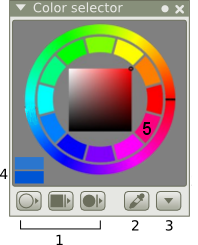
1. Options for the shape of the selector,
e.g.: rings with picker, squares, wheels, mixing sliders
2. Pipette with adjustable size
3. Menu with additional options
4. Old and new colour
5. Ring of harmonic colours
This will be available through drag and drop.
Wow, very interesting improvement! That is something what would help a lot on graphic design.
It has not been enough that you can choose from color palette (in different kinds) what color needed. But that you would actually get all the shades and contrary colors as well. Like if you select black, you could get easily choose white (okay, black is not really a color but lets play now it is). Or when you select yellow, you get purple for contrast color.
One thing what I always miss, is the one great GTK+ application what gives user a 3-5 harmonic colors. I do not now remember the name of the application. But you choosed one color and then the “algorithm” what then gave you + 2-4 colors what would fit with it.
Do you mean that with the “harmonic colors”?
I remember how fascinating the art classes were when the colors were in subject. We spended only 2 months with colors, their shades and their relation to each other.
Before that the colors were just as “colors”. After that, it has be very interesting topic for me. Very nice to see someone is improving that area.
Ah, now I remember the GTK+ app name, a Agave.
http://www.gtkfiles.org/app.php/Agave
Okay, that looks very nice.
Does the pipette calculate avarage color from the bigger area?
That was something what I wanted to see in GIMP and they added it. Could there later be a feature to select how the region is selected? Like is it retancle, round etc?
And would it be possible to have 2 last colors be shown? Is there any sense for it? I like the current dialoge in KDE apps where you can see big row of last chosen colors. They just are separated and so small that it is hard to notice difference sometimes. (same thing I would hope on that, so there would be no space between new/old color).
That just looks nice and great improvement.
thanks for the link to agave, i will look into it, when doing the harmonic colours.
yes, it will be the avarage colour, but i don’t see the advantage of being able to select the shape of the pipette. can you explain?
maybe it will be possible to configure the count of last colours, but that is far in the future for me now.