One of my goals in my project was to create a colour selector, which has many features but uses little space. However it’s hard to select a colour, if the chooser is small, because 1. it’s small and 2. a small chooser with view pixels cannot show all colours.
I approached this from two sides: a space efficient and configurable layout, so that the user can select whichever size fits him best and an optional zoom, so that the user can make the widget small and yet simply make the chooser bigger, if he needs it.
Edit2:
The colour patches below the selectors represent common colours from the image and on the right there will be a history of last used colours..
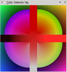
So here are some screenshots, on how it looks like currently.
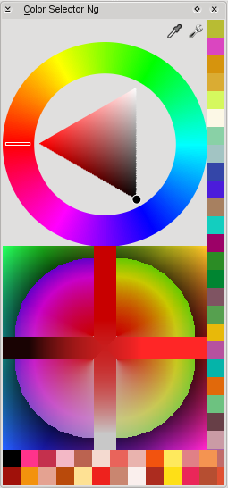
This is a ‘big’ layout,
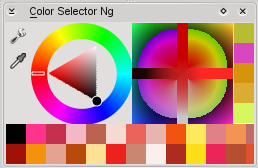
‘small’ and space efficient,
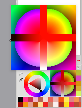
a popup with a bigger selector,
and finally a page from the settings window.
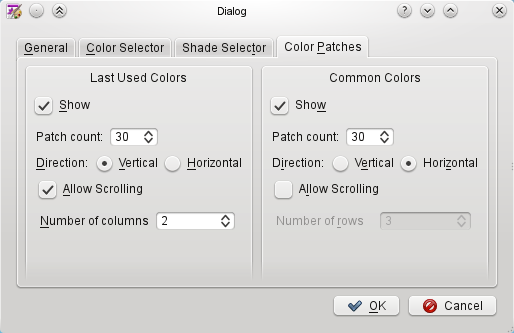
Not all of the settings are connected already, the colour selector (triangle in the images) is just a dummy and the whole thing is not connected to the painting colour.
But I hope to get some comments on the layouting, maybe some more ideas and so on. I’ve just enabled building of this plugin in trunk, if you want to test it, you probably also have to enable this docker in settings menu -> dockers -> Color Selector Ng.
Edit:
This is still work in progress, next steps will be to gather some comments on usability, refine layouting and move on to implement pigment, colour selectors and so on. It’s not even half time of GSoC :)


 .
.