One of my goals in my project was to create a colour selector, which has many features but uses little space. However it’s hard to select a colour, if the chooser is small, because 1. it’s small and 2. a small chooser with view pixels cannot show all colours.
I approached this from two sides: a space efficient and configurable layout, so that the user can select whichever size fits him best and an optional zoom, so that the user can make the widget small and yet simply make the chooser bigger, if he needs it.
Edit2:
The colour patches below the selectors represent common colours from the image and on the right there will be a history of last used colours..
So here are some screenshots, on how it looks like currently.
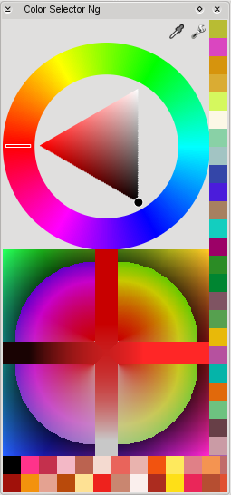
This is a ‘big’ layout,
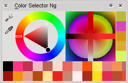
‘small’ and space efficient,
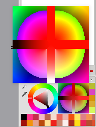
a popup with a bigger selector,
and finally a page from the settings window.
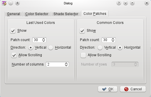
Not all of the settings are connected already, the colour selector (triangle in the images) is just a dummy and the whole thing is not connected to the painting colour.
But I hope to get some comments on the layouting, maybe some more ideas and so on. I’ve just enabled building of this plugin in trunk, if you want to test it, you probably also have to enable this docker in settings menu -> dockers -> Color Selector Ng.
Edit:
This is still work in progress, next steps will be to gather some comments on usability, refine layouting and move on to implement pigment, colour selectors and so on. It’s not even half time of GSoC :)
I am sure it took quite some work but leaving literal rough edges will not make a great impression! Good work though!
I’m unsure, what you mean. This is of course work in progress and I’m not done yet.
To be honest, I do not understand the idea behind the second color choser. It seems to waste lots of space by being mostly mirrored on the Y-Axis. But then, its not completely mirrored. Many colors even seem to be present multiple times.
Is this a placeholder for something else?
Looks awesome! The “commonly used colours” sounds very, very useful (do any other apps have this yet?).
Given that it’s not even halfway yet, we’ll be expecting something doubly amazing by the end! :P
btw, I think Rsh was requesting anti aliasing on the edges of the shapes drawn in the colour selector. That would be my guess anyway.
Nice work! /me runs to recompile trunk :)
Adam probably meant the aliased edges of the pie pieces in the “new style” selector. That should be easily fixable by setting a QPainter flag.
Have you considered using something like Inkscape’s color-bar (don’t know if that’s really its name or not)? The bar along the bottom of the image which holds the colors of the current palette for quick selectional. The only question I would have is whether or not that would be a good use of space, though if it were optional it could be nice.
Moreover, a proper color-mixing scheme, on the picture, and maybe on a separate dock (i.e. an actual palette replica), would allow you to mimic the painting technique of using a limited set of colors and letting them mix to create the appearance of many colors, while keeping the image coherent.
Perhaps someone will be able to glean some useful information/insight from that… even if it did get a bit long-ish.
@ben
it is probably a bad screenshot, but the second colour chooser is not mirrored. the bottom side gets lighter, if a brighter colour is selected. if i have time in the end of summer, i will maybe try to make it better. there are also some ideas on the mypaint wiki (http://wiki.mypaint.info/Brainstorming/UI/ColorSelector#Color-changer_modifications).
the idea is to provide shades, so that an artist can see and choose colours, which he maybe haven’t thought of.
i will look into the anti aliasing thing, but it won’t be that easy as setting just one flag.
The Inkscape color-bar looks cool to me. I’ll maybe try to create a similar docker/widget, but that’s rather a bonus for the end of summer also.
Mixing colours is in the plans for krita 2.3 (afaik), some parts of it are already implemented. you can look for details here [ http://wiki.koffice.org/index.php?title=Krita/Painterly_stuff ].
thanks a lot for the comments..
Are you going to make this a stand alone app so that the eyedropper can be used to find color values for use with other applications, not just krita or is there already something like that? I think there is and it’s for Gnome.
no,
this tool will work for krita, karbon and maybe other office apps.
if you just need the colour picker (pipette), you can use kcolorchooser. there will also be drag’n’drop for colours.