My last blog was long ago. I know, this is bad, i should blog every week, but well i didn’t really had interesting news.
I was doing very much small changes, tweaks, bug fixes, layouting code and much more. The last bigger addition was the minimal shade selector, I will talk about it in a few lines.
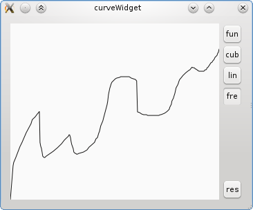
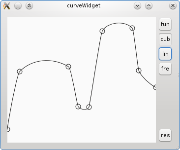
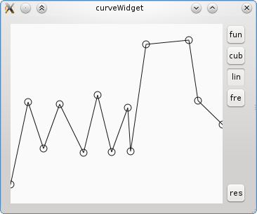
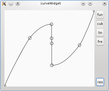
But first here is a small summary, of what i was doing since the last blog post: I’ve connect the colour selectors to the resource manager, made the settings save to kritarc, added a tab in krita preferences (thanks Boud for the new registry, that was needed for that), added a colour history, moved the settings button to a more space efficient place, implemented drag and drop for colours, shortcuts for quick access and an api for setting a colour. The last point was actually much more difficult, than it sounds, because of the way, the selectors work with colour spaces. The selector has to search for the colour, that generates the user visible colour by using the colour spaces. Here is an attempt to explain it graphically.
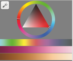
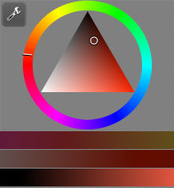
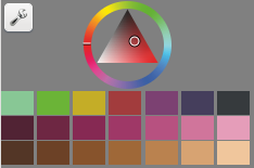
Lets turn to a slightly more interesting thing, the minimal shade selector. Probably some pictures are better than 1000 words :)


It’s the bottom part with the gradients / patches.
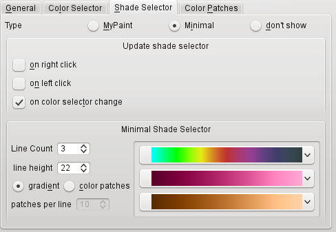
Here is the configuration dialog.

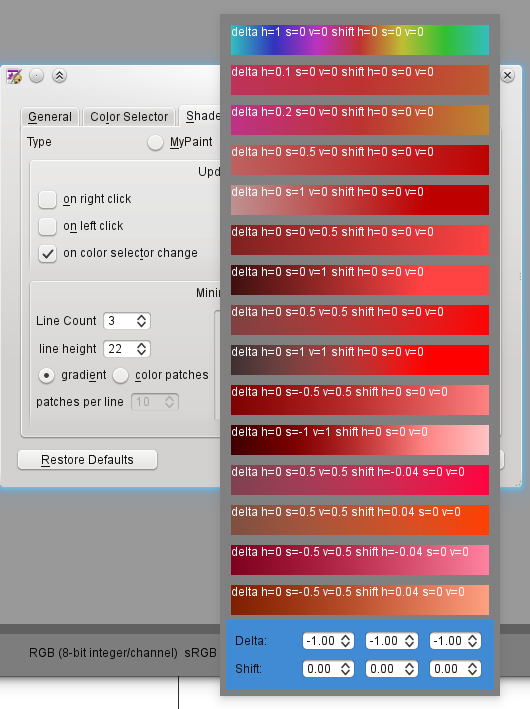
And the combo box for selecting the gradients.

You can select one of the predefined gradients or configure one in the highlighted area.
That’s it for now..
Next Tuesday I’m going on a motorcycle trip to Constanta, which certainly will take a few days. So in that time I will be offline. Hopefully the weather will be ok :D
